
Turning a Hostage Situation into a 3-Minute Success Story
Kommo puts WhatsApp, Instagram and Messenger conversations into one inbox so nothing gets missed. The product works. The entry point didn't.
TIMELINE
PLATFORM
MY ROLE
Mar 2026 - Apr 2026
iOS & Android App
Product Designer (UI/UX)
TOOLS
TYPE
Figma, Framar
Conceptual Redesign
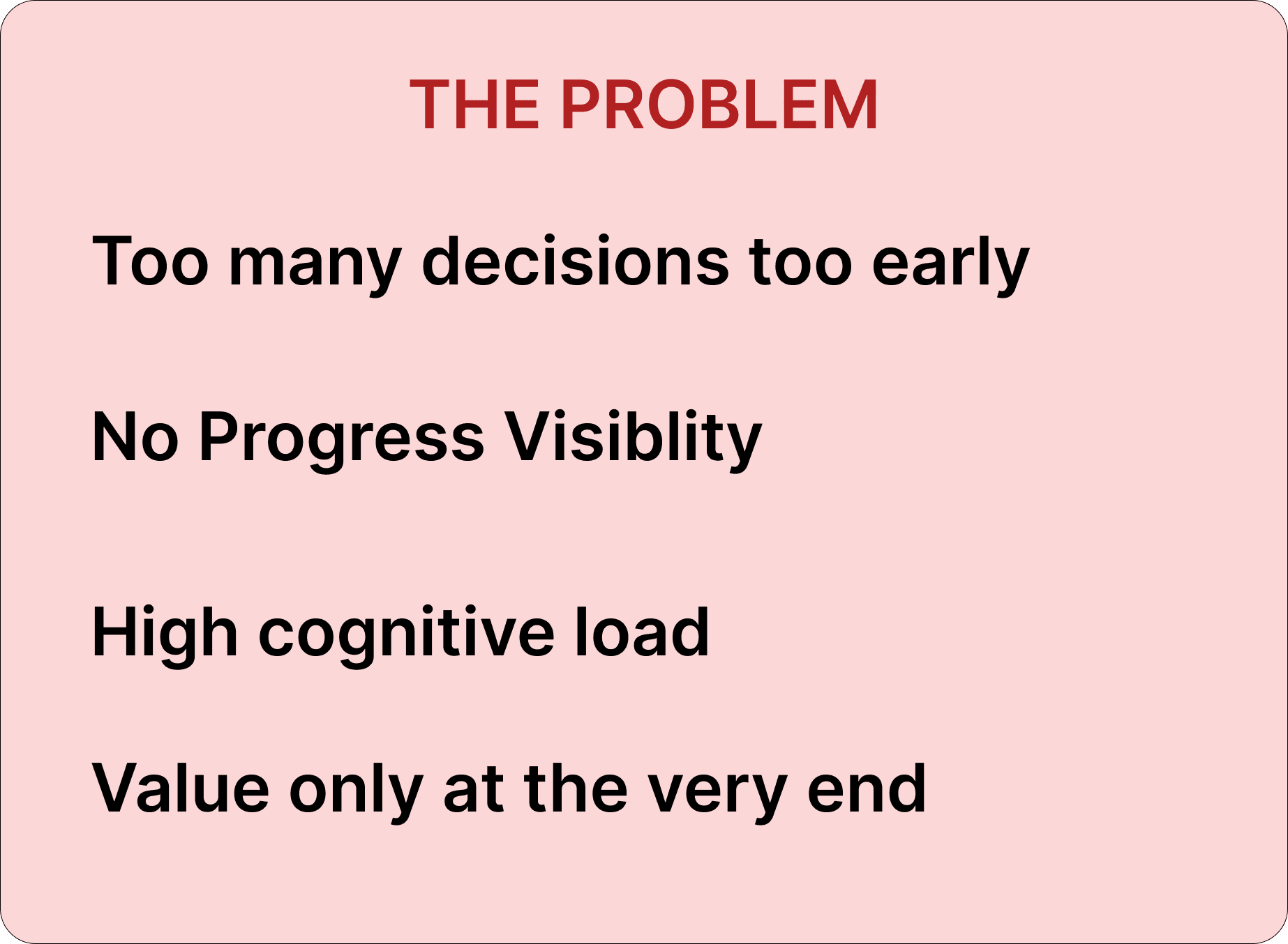
The Problem
While Kommo's backend is incredibly powerful, its core app experience has remained largely unchanged for years. Through user research and teardowns, I identified three major gaps in the current onboarding and communication flow

Defining the problem
“How might I redesign the onboarding experience to eliminate friction and guide users to Kommo’s core value in under 3 minutes?''
Project Goal
BUSINESS GOALS
Accelerate User Activation:
Optimize the initial drop-off rate by guiding users to connect their communication channels within the first 3 minutes of opening the app.
Build Scalable Infrastructure:
Establish a robust and repeatable mobile UI design system to drastically reduce layout inconsistencies and eliminate future technical debt.
USER GOALS
Eliminate Cognitive Overload:
Replace heavy, unguided operational forms and multi-level data dropdowns with a clear, minimal, and guided wizard.
Deliver an Instant 'Aha Moment':
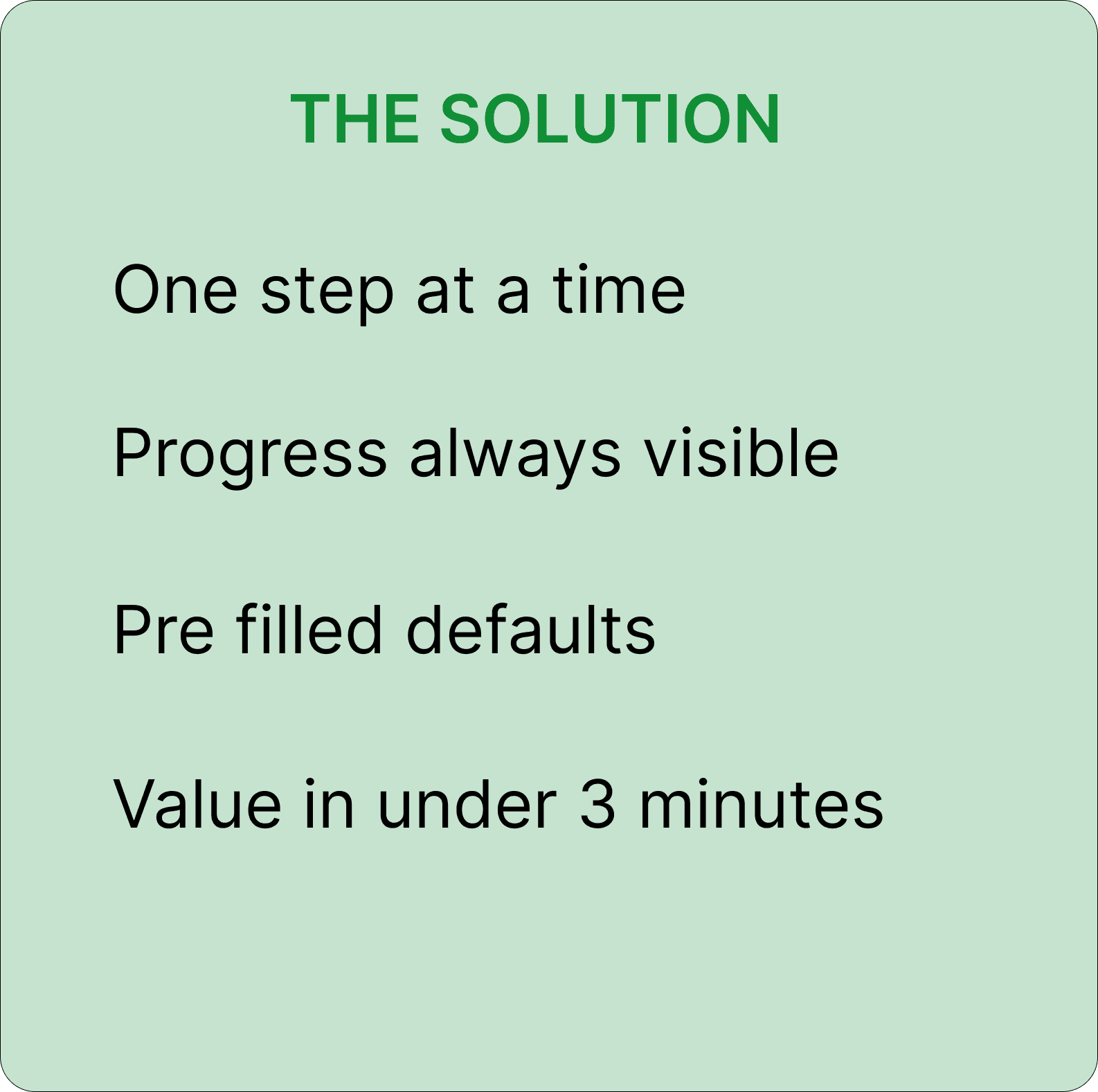
Shift the product experience from tedious data entry to immediate value by prioritizing direct WhatsApp and Instagram integration right at the start.
See it in Action
"Experience the interactive prototype firsthand. You can either watch a quick 1-minute video walkthrough of the key interactions or test the live prototype yourself."

Watch 1-Min Walkthrough
Research
50+ reviews read across Google Play Store and G2
User Complaint Design response
''The setup is a nightmare''
Added Step X of 7 progress bar throughout
"I felt like a hostage"
Pre-filled defaults + visible "change this later" option
"WhatsApp disconnected silently''
Real-time sync animation + success confirmation
Kommo's Play Store rating: 4.1 from 560 reviews:
The product is liked. Onboarding is where it loses people.
What other apps do well


Show only what's needed Applied: pre-filled industry and role users confirm a choice instead of making one from nothing.
Human language reduces software anxiety Applied: "Hi there! What's your name?" instead of a cold labelled form field.
Make integrations feel real Applied: loading animation and "Link Copied" success screen — so users know the system is actually working.
Who I was designing for
Build from real Kommo Play Store reviewers
How Priya experienced the original flow

Handles customer messages across WhatsApp, Instagram, and email simultaneously. Downloaded Kommo after a recommendation. Hit the CRM setup screen. Had no idea what "Industry" meant for a business of one. Closed the app.
She didn't need a simpler product. She needed to see it working before she trusted it.
Priya doesn't think in UX terms. She just knows the app felt like it was built for someone else. That feeling "this isn't for me" is what the redesign needed to fix before anything else.
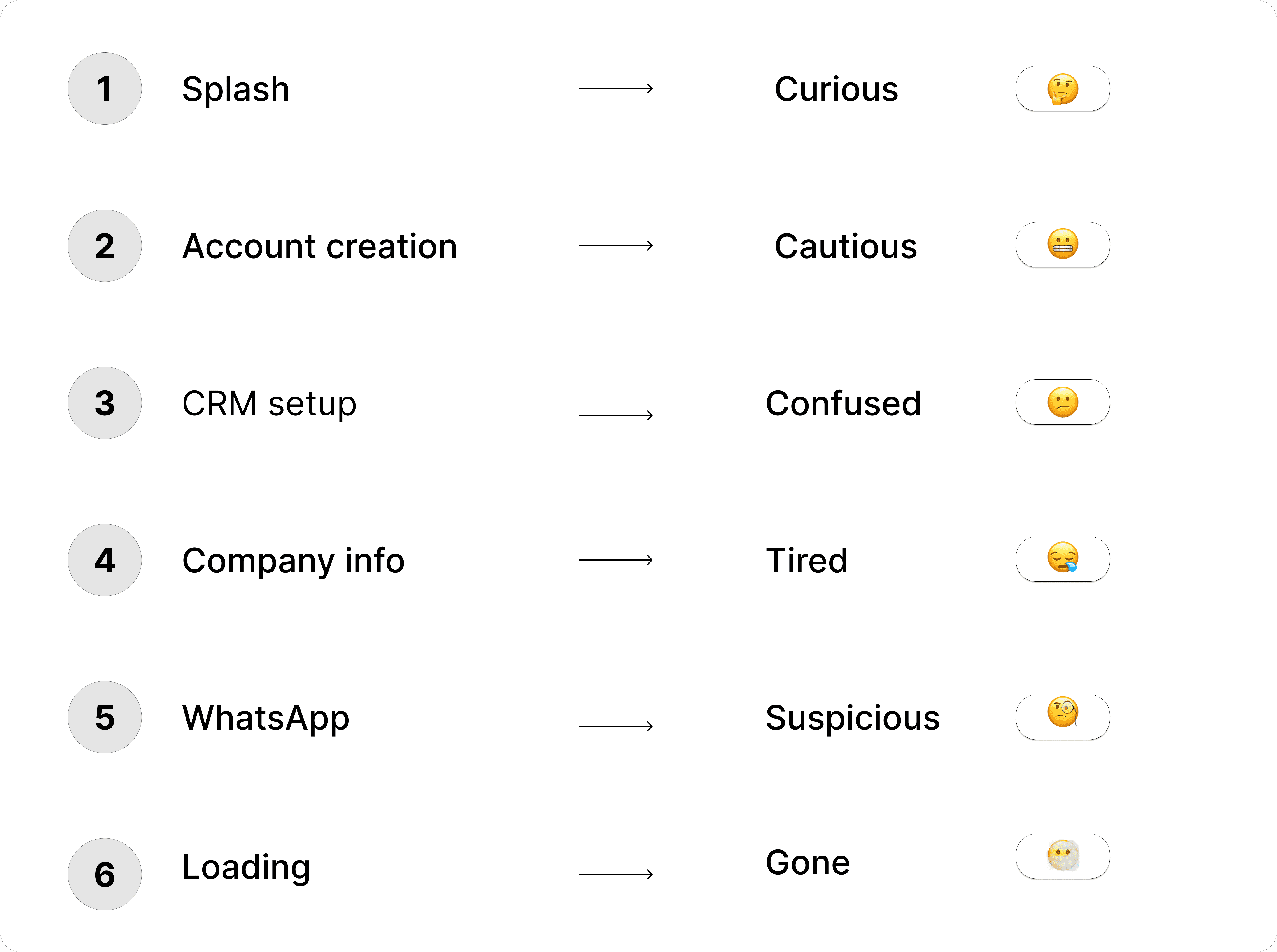
The original flow never reached relief. The redesign needed to get there by step 5.
Process
Ideation Crazy 8s
This is where the design process got messy. I set a strict timer to prioritize volume over perfection exploring as many layout directions as possible without getting attached to any single concept.
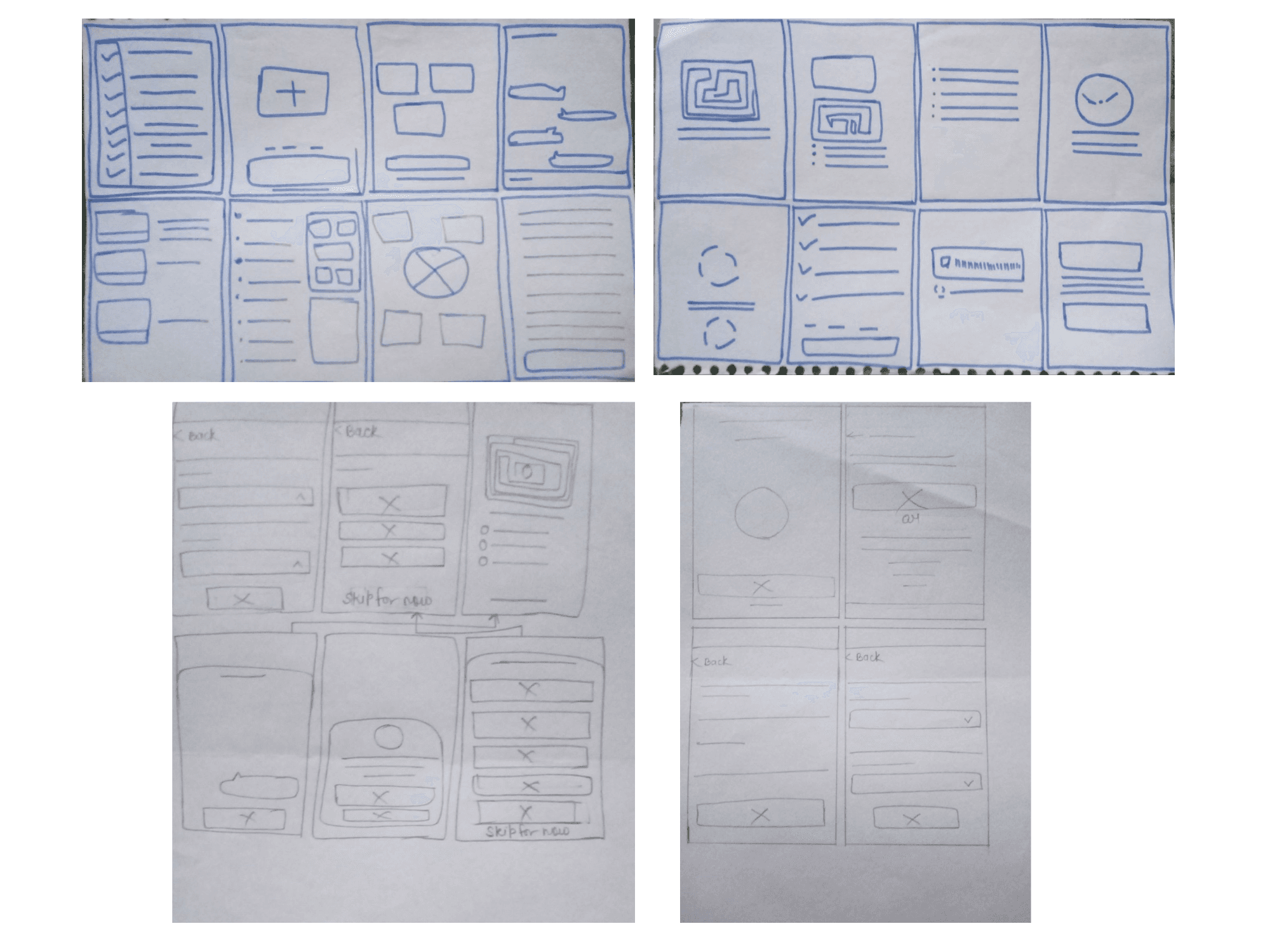
CRM setup what I explored:
Full blank form rejected immediately
Pre-filled with edit option eventually selected
Visual chips instead of dropdowns
One question per screen
Skip it entirely ask in settings later
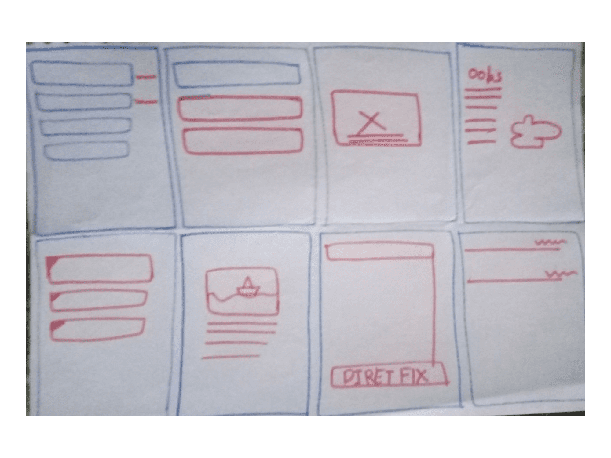
Loading screen what I explored:
Progress bar only too empty, feels broken
Percentage counter too cold, no warmth
Animated illustration with copy selected
Skeleton preview of incoming leads interesting but too complex to implement cleanly
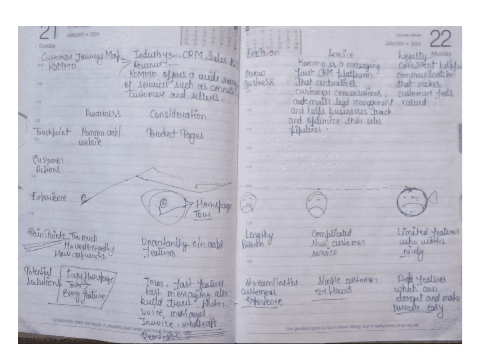
These raw notebook sketches capture the initial brain-dump translating user pain points into a structured onboarding flow before any digital wireframing began.
Here's where the feedback got conflicting:
Some feedback said chips felt more native to mobile — faster, more visual, less like a form.
Other feedback said pre-filled dropdowns felt more familiar — especially for non-technical SMB users who've used CRMs before and expect dropdowns.
I wasn't sure which was right. I still am not completely certain.
I went with pre-filled dropdowns because they required less cognitive switching for a user who has just created an account 30 seconds ago. But I'd want to A/B test this. The chips direction might outperform. My instinct is not data.
What Crazy 8s gave me :
Designs that reduced anxiety most answered two questions at once what is happening and what is coming next. That became a principle for every screen.
Wireframes
Paper first Paper first. Rough, fast, no attachment.
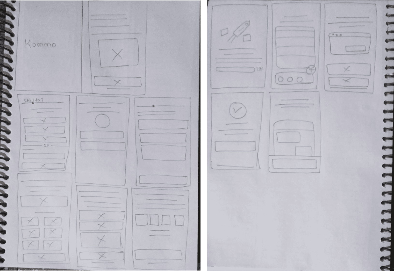
Avatar above the form on the name screen — not below
Value copy above the progress bar on loading — not below
Trust badge between input and button on WhatsApp — not at the bottom

Lo-fi in Figma followed grey screens, no colour, three iterations on layout before moving to high fidelity.
What Failed and Why?
"My initial version relied on a QR code connection. It was a complete bottleneck for first-time onboarding."
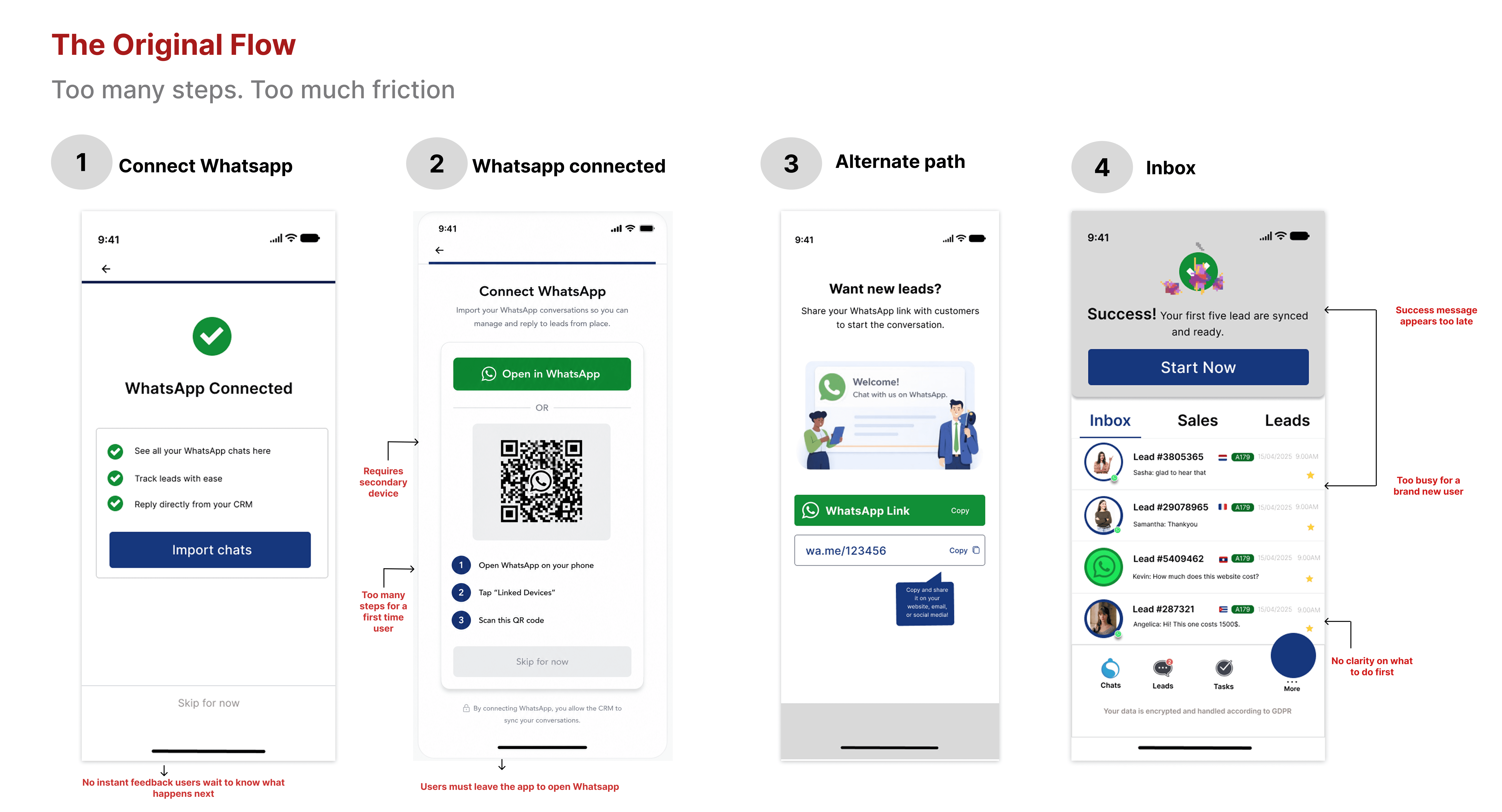
The Flaw:
It required two devices simultaneously WhatsApp open on one, Kommo on another. For a user who just signed up 30 seconds ago, it felt broken and high-friction.
The Designer's Trap:
After it failed, I almost went back to it twice. Not because it was right, but because the alternative (Phone + OTP) felt too simple. I was trying to be 'clever' instead of being useful.
The Realization:
The boring solution was the correct one. Users need a 30-second, single-device connection. Recognizing when the obvious choice is the right choice took longer than it should have, but it shaped my entire approach.
Failed Screen 2: Splash Screen with Wrong Illustration
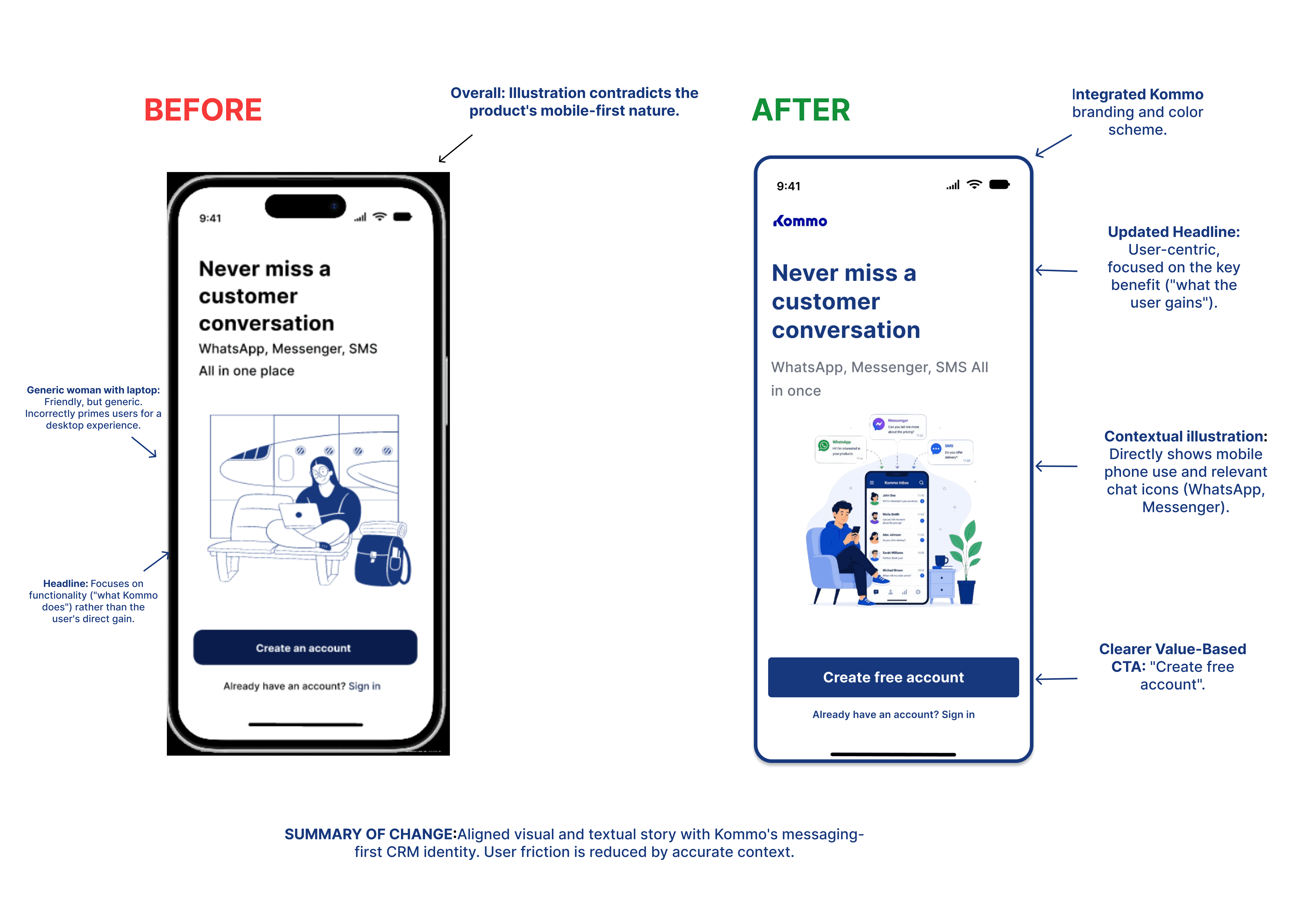
My first splash screen used a woman sitting with a laptop. Friendly, clean, generic.
Kommo is a mobile CRM built around WhatsApp conversations. A laptop on screen one tells the wrong story before anyone reads a word. The headline described what Kommo does — not what the user gains.
AI critique on this screen: "The illustration contradicts the product. A user can't tell this is a mobile-first messaging CRM. Show conversations and channels — the actual thing Kommo does."
Replaced with: person using phone with WhatsApp and Messenger icons. Headline changed to "Never miss a customer conversation."
Five Rounds of critic
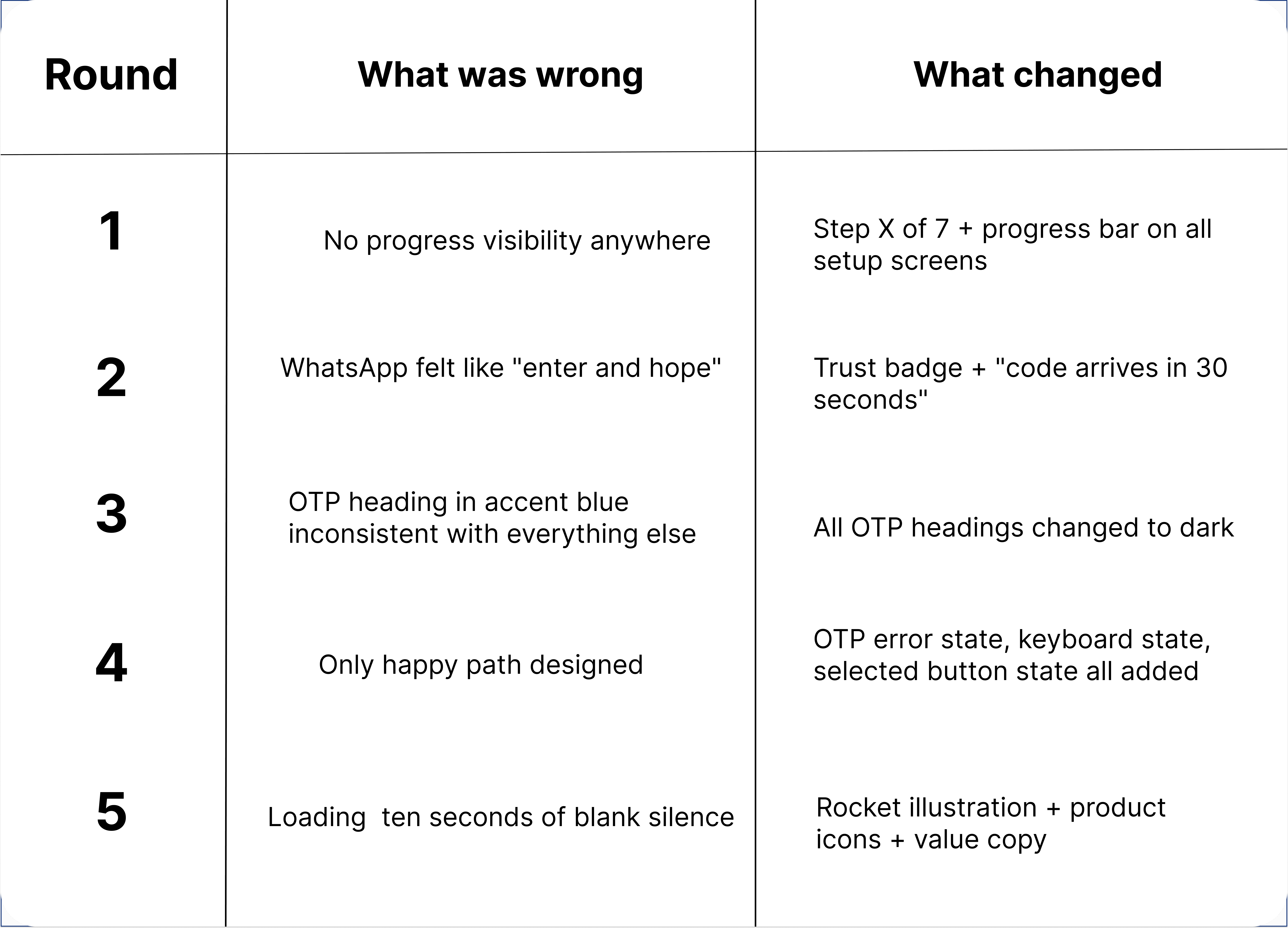
Reddit Feedback What changed
I posted before/after screens to Reddit's UX design community.
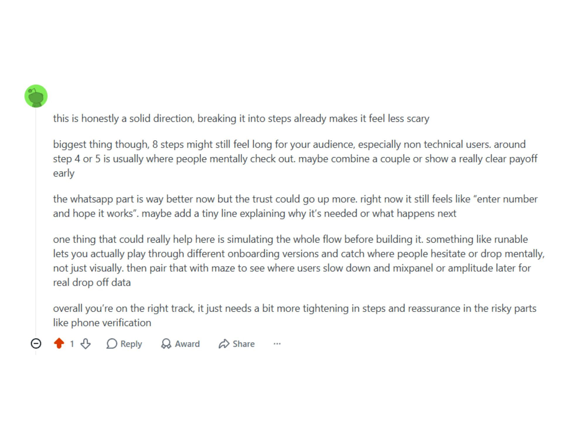
Two direct changes:
Flow dropped from 8 steps to 7. Step 3 became a confirmation screen pre-filled, one tap to continue.
WhatsApp screen gained: "We'll send a 4-digit code. It takes under 30 seconds." One sentence. Answers why, what, and how long before users have to ask.
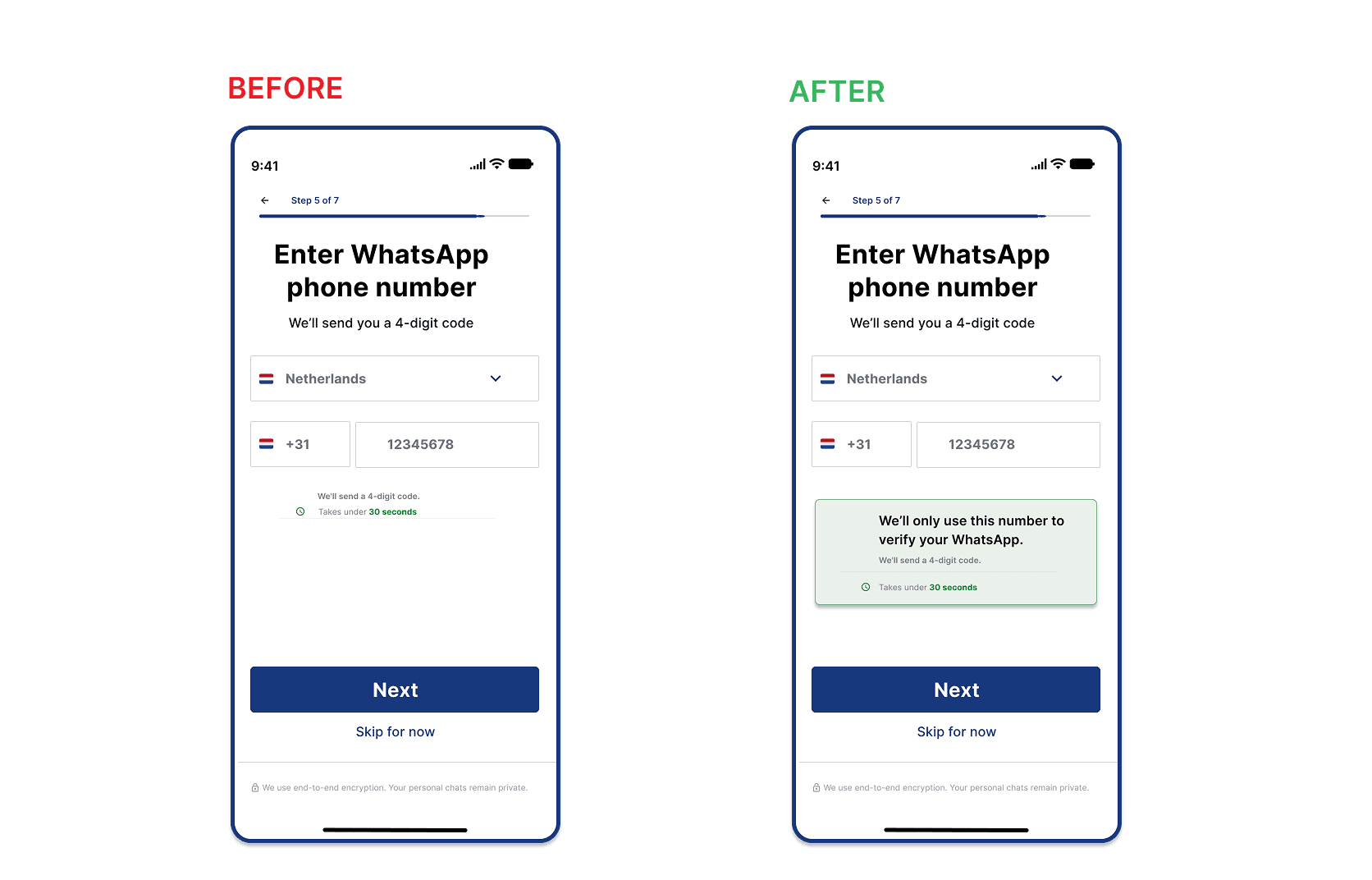
The Decision I Was Most Uncertain About
I genuinely considered removing the CRM setup screen entirely.
The cleanest onboarding would skip it. No industry dropdown, no role selection, no friction at step 3. Users configure from settings whenever they're ready.
But removing it created a real product problem:
Kommo's recommendation engine uses industry and role data to personalise the experience from day one. Without it, the Aha Moment inbox shows generic leads not leads that feel relevant to the user's actual business. A florist sees the same inbox as a law firm. The value delivery moment becomes weaker precisely when it needs to be strongest.
This wasn't a UX decision. It was a product tradeoff cleaner onboarding versus weaker personalisation. I chose to keep the screen but make it as close to invisible as possible: pre-filled defaults, one confirmation tap, an escape hatch visible throughout.
How I would Validate This in a Real Product Team
How much does personalisation actually affect 7-day retention? If the answer is "not much," remove the screen. If it's "significantly," keep it. I made a call based on reasoning. A real team would run the test.
Proof of reality Try the flow
Focus on Three moments:
Name input → keyboard appears → Dutch autocomplete visible
WhatsApp verification → trust badge → OTP entry → error state
Loading animation → Aha Moment inbox reveal
→ Watch the 90-second Loom walkthrough
I recorded myself clicking through the prototype and explaining the three decisions that matter most the trust badge placement, the loading screen copy, and why the Aha Moment shows channel icons.
If you want to see how I'd present this in an interview this is it.
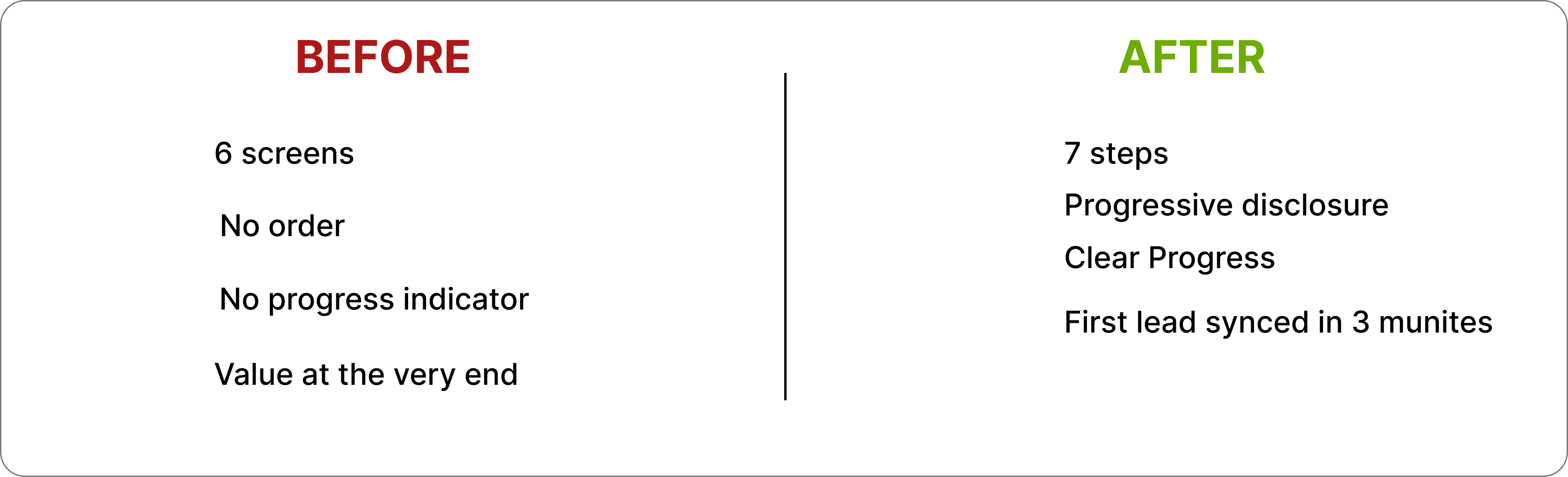
ONBOARDING REDESIGN: BEFORE vs AFTER
From a confusing 6-screen setup to a 7- step progressive flow that gets users to their
first lead in under 3 minutes.
BEFORE confusing setup maze


AFTER: A CLEAR 7 STEP PROGRESSIVE FLOW
Five Screens that matter the most
Name Input Keyboard state

WhatsApp Trust Badge

OTP Error state

Aha moment

Loading Screen

Alternate Aha moment

Design System
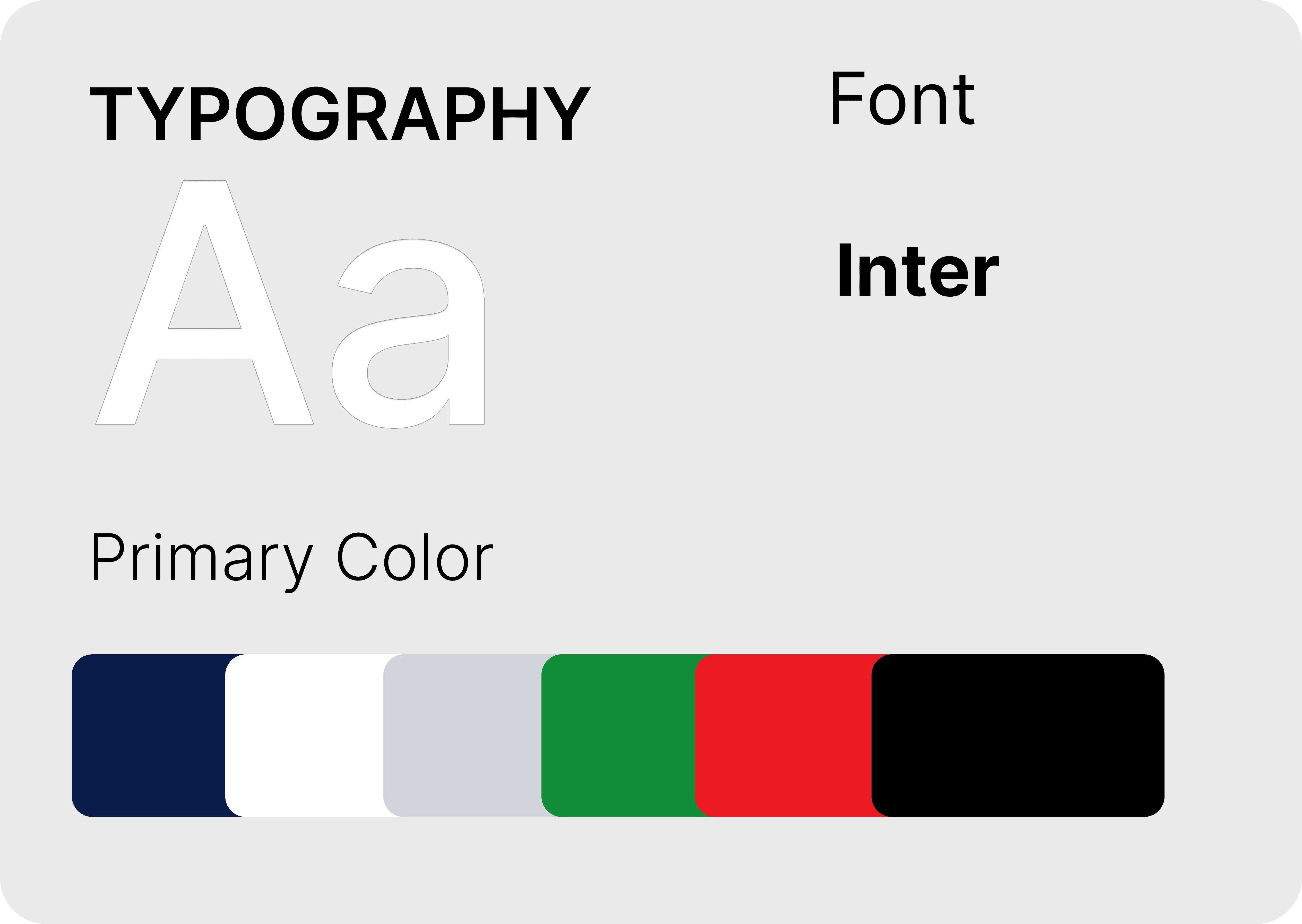
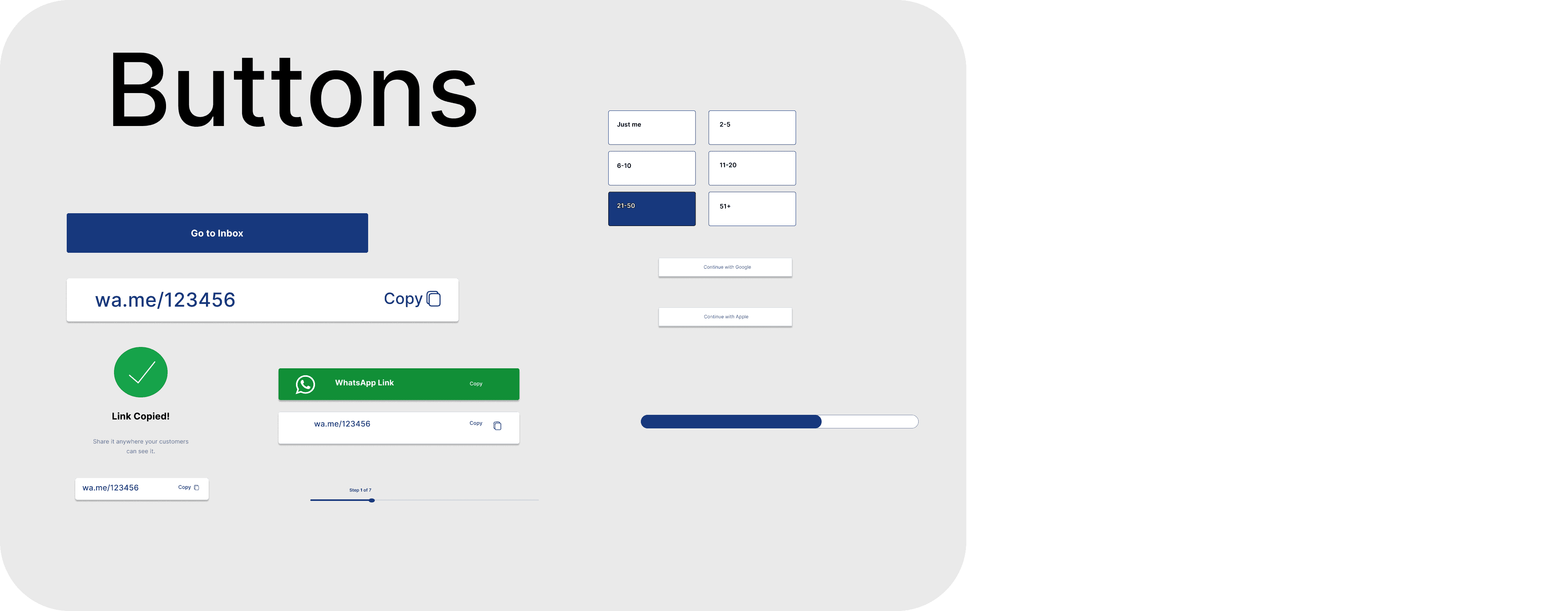
Colours: #1B2B6B — headings, buttons, selected states #3D52D5 — progress bars, active borders #25D366 — WhatsApp CTAs #16A34A — trust badges, success states #DC2626 — error states #111111 — all body text
Typography: Inter throughout H1 28px/700 · H2 22px/600 · Body 15px/400 · Caption 12px/400
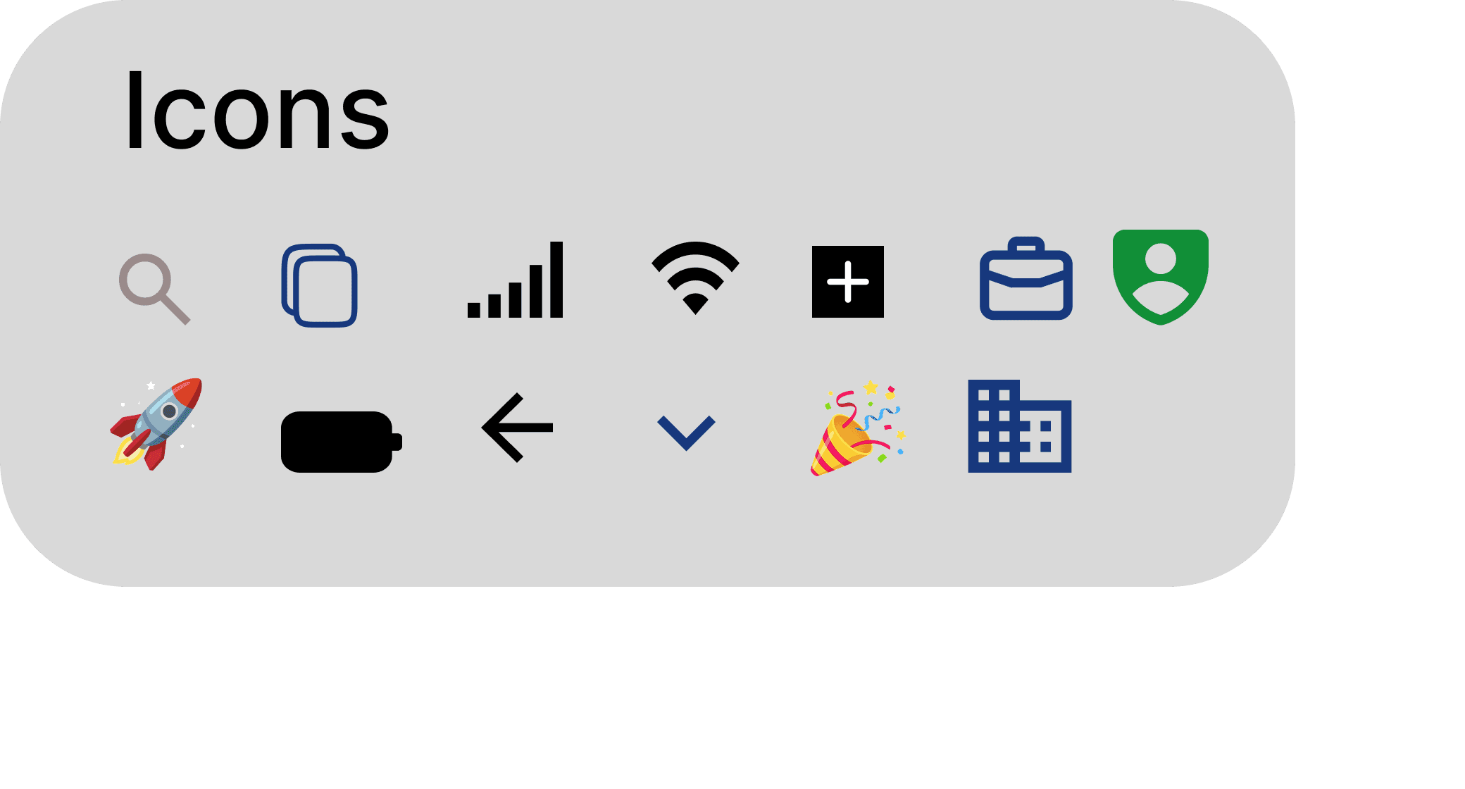
Components built: Primary button · Input field (4 states) · Progress bar · Step label · OTP box (4 states) · Team size button (2 states) · Trust badge · Bottom nav · Dropdown
Accessibility: WCAG AA contrast throughout. UI supports longer Dutch text strings.
Dev handoff: Auto Layout throughout. Named layers. Every component reusable. File inspectable without a designer present.
Outcome
A 6 screen configuration maze became a 7-step progressive flow. Users reach their first synced lead in under 3 minutes.
If shipped I'd measure:
A 6-screen configuration maze became a 7-step progressive flow, cutting the time-to-value to under 3 minutes. But as a solo designer, my instinct isn't data. If shipped tomorrow, I would immediately track success through three critical lenses.
Activation (Did it work?):
I'll measure Time-to-first-lead via Maze to validate if the faster loop holds up, while tracking the WhatsApp connection rate internally as our core business engine signal.
Friction (Where is it breaking?):
Instead of guessing, I'll monitor Per-screen completion using Mixpanel to pin down exactly which step or input field is still causing user drop-offs.
Retention (Did we build lasting behavior?):
Finally, I'll track 7-day retention via Amplitude to prove if our early 'Aha!' moment actually creates long-term value, using a baseline Usability score on Maze to guide the next product sprint.
What I learned
Loading screen is not dead time
Ten seconds of nothing feels like a crash. The moment I added a copy explaining what was happening and what was coming, the screen stopped feeling like a problem and started feeling like part of the product.
Obvious is not a failure
I spent time looking for a more interesting solution than phone number plus OTP. There wasn't one. Knowing when to stop looking clever and start solving the actual problem is something I learned on this project, not before it.
Uncertainty is information
The chips versus dropdowns question is still open. The CRM setup removal is still a hypothesis. Writing those honestly feels uncomfortable. But a case study that resolves every question neatly is probably hiding something
What I'd Do Differently With a Real Team
Run the A/B test on chips versus dropdowns
I made a call. I want to know if it was right
Remove the CRM setup screen and measure retention impact
My reasoning for keeping it was sound. But reasoning is not data.
Industry-specific Aha Moment
A florist should see florist conversations. Generic value lands weaker than specific value.
Full screen reader audit on OTP flow.
WCAG AA contrast is a baseline — not a finish line
Contact
Radhika Singh
Remote: CET hours
Email: radhikasinghh053@gmail.com
LinkedIn:
Looking for a contract-to-hire role with a Netherlands-based startup